In todays world, where a vast amount of data is generated each day the ability to extract valuable insights from this data is crucial for any business. Data visualization is the process of representing data in graphical form. It empowers tourism professionals to make informed decisions and to better understand customer behavior. This ultimately enhance the overall experience for visitors. In this blog post we talk about advantages of data visualization and present best practices for data visualization. In the end of the post possible use cases where data visualization could be used in the tourism sector are mentioned.
Why visual information is easier to grasp
Data, in its raw form, can be overwhelming, complex and therefor difficult to understand. With data visualization we unlock the potential to comprehend patterns, trends, and correlations that might be obscured in the raw data. Visual content is processed much faster than written content because the human brain is pre-programmed to understand visuals.
Data visualization facilitates a deeper understanding of information by transforming raw data into visual representations such as charts, graphs, or maps. Visuals often aggregate data and therefor allow to better understand trends and relationships in data.
Some Advantages of Data Visualization
Data visualization brings a lot of advantages. Some are mentioned below:
- It simplifies complexity and makes data easier understandable
- Data becomes more accessible.
- It allows to identify patterns, trends, relationships, and correlations.
- It simplifies communication of findings and insights and provides a foundation for decision-making
- It allows real-time monitoring and analysis
Best practice in data visualization
Effective data visualization is not just about the data or choosing the right tools. It also involves following best practices to ensure that the message you want to convey is clear, accurate, and impactful. Below you will find some best practices for good data visualization.
Know your Audience
To get the best out of a data visualization it’s essential to know the target audience. Consider their background, knowledge and the key insight or message they need from this data visualization.
Simplify Complexity
Focus on the key message for your defined target group and remove unnecessary details.
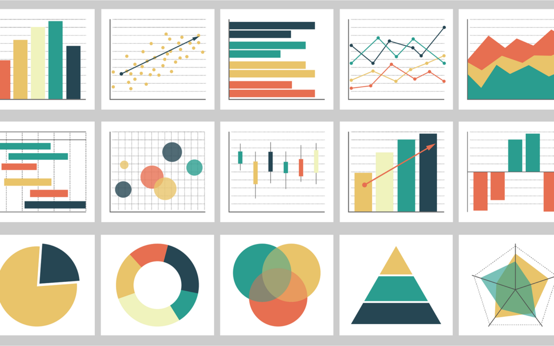
Choose the Right Chart Type
If you want to be sure that your target audience understands your visualization work with well-known chart types and select the appropriate chart type for your data. For instance: Bar charts for comparisons, line charts for trends over time, and pie charts or stacked bars for part-to-whole relationships.
Use Color Thoughtfully
Use color to highlight important information and create a visual hierarchy.
Provide Context
To help your audience to understand the data provide context, by adding titles, axes labels and if necessary, annotations.
Ensure Accuracy
Double-check your data for before creating visualizations. Inaccurate data can lead to misleading visuals and conclusions.
Emphasize Key Findings
Highlight important information or key findings with colors or annotations. Guide your audience’s attention to the most important aspects of the data.
Tell a Story
To fully understand data visualization the story behind is essential. Arrange your visualizations in a logical order to tell a coherent story. Guide your audience through the data(visualization).
Possible Use Cases in the Tourism Industry
Data Visualization can be used in any discipline and on any dataset. Here we would like to talk about possible use cases especially for the tourism industry.
Create Personalized Experiences
Data visualization empowers tourism professionals to understand customer preferences, behavior, and demographics. By visualizing data, such as booking patterns, search queries, and feedback, businesses can tailor their offerings to meet the individual needs and desires of tourists.
- Route Analysis for Switzerland Tourism (How people travel within Switzerland)
Better Destination Management
By analyzing tourism data, such as visitor flow, attractions popularity, and transport networks, stakeholders can identify areas for improvement and optimize resource allocation. Visualizations can assist in identifying overcrowded or underutilized locations, optimizing visitor flows, and ensuring the sustainable management of tourist destinations. Follow this link to get to know the use case “Visitor behaviour analysis” where data from Swisscom Mobility Insights, Mastercard and intervista will be connected to provide insights.
Market Intelligence
Another interesting use case is market intelligence. By visualizing market trends, competitor analysis, and customer sentiment, stakeholders can identify new opportunities, develop effective marketing strategies, and adapt their offerings to changing demands.
- New Zealand Tourism Spendings
- Education and labour market data by HotellerieSuisse
- World Tourism Report (experimental)
Real-time analysis
Visualizing real-time data, such as traveler sentiment, occupancy rates, or weather conditions, enables stakeholders to respond swiftly and effectively. Visualizations help allocating resources efficiently and communicating important information to tourists and other stakeholders.
Data visualization is a transformative instrument that empowers the tourism industry to leverage the power of data, unlock insights, and enhance the overall tourist experience. In a next blog post we will present some tools to visualize data and to create convincing data stories.