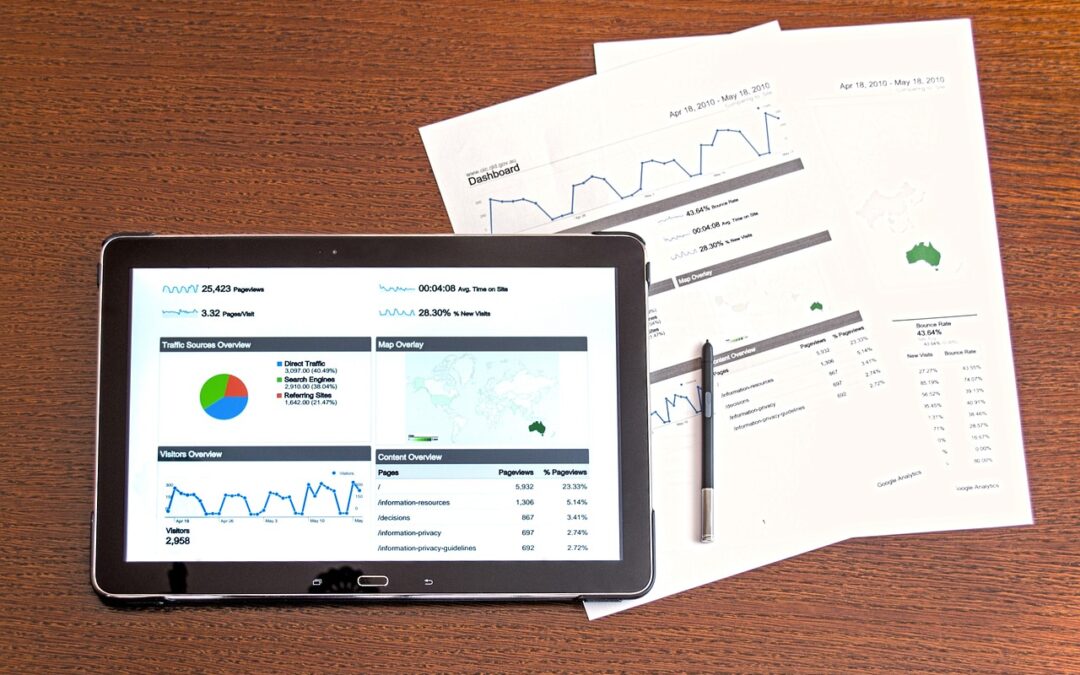
To better understand any business, it is crucial to analyse the vast amount of data to find the most relevant information and generate new insights. A good way to make data accessible is to visualise it. By visualising complex data, it is easier to see patterns and relationships. Effective data visualisation is not only about the data, but also about using the right toolbox. In this blog, we present some tools that are commonly used for data visualisation and data storytelling.
There are several tools that empower organizations to create impactful visualisations. These tools vary in complexity, costs, and the handling, catering to different user needs and skill levels.
In this section we divided the tools into three categories, firstly tools that have a drag-and-drop handling, secondly tools that are Open Source and lastly some libraries to visualise data by coding.
Drag-and-drop Tools
Tableau by Salesforce
Tableau is well-known in the field of data visualization. Its intuitive drag-and-drop interface allows users to create interactive dashboards. With support for various data sources, Tableau is widely used across industries. If you are looking for inspiration, check out Tableau Public.
Power BI by Microsoft
Power BI is a user-friendly drag-and-drop tool that seamlessly integrates with other Microsoft products. Its strong data connection capabilities and interactive visualization features make it a popular choice for businesses looking to gain insights from their data.
Looker Studio by Google
Looker Studio (before Google Data Studio) is a cloud-based tool that enables users to create interactive and shareable reports and dashboards. With its seamless integration with other Google products, it’s an accessible choice for those already embedded in the Google ecosystem.
Open Source Tools
Datawrapper
Datawrapper is a no-code tool to create powerful visualizations. Datawrapper wants to enable everyone to create beautiful charts, maps and tables. The tool is especially used by newspapers to enrich stories with data. The application is easy, copy and paste your data, edit your chart and download or embed your visualization.
RAWGraph
RAWGraph is a free and open-source product to generate beautiful visualizations. The data can be uploaded or entered per copy and paste. To create visualizations, select your preferred chart type and chose the relevant data per drag-and-drop. The visualization can then be downloaded in various data formats.
Infogram
Infogram is another web-based tool to create infographics. The tool allows people to make and share digital charts, infographics, and more. The tool is known as WYSIWYG tool, meaning that the user sees what he gets in the end. This makes infogram very accessible and easy to use. Inspiration can be found on the website of infogram.
Coding libraries
Matplotlib
Matplotlib is a popular open-source plotting library for creating visualisations in Python. It provides very precise control over visuals, but it can require considerable code when the visualisations become more complicated. The library provides the user with a broad range of chart types to use.
Seaborn
Seaborn is another open-source plotting library that is built on top of Matplotlib. It provides a simpler Python API that requires less code than Matplotlib. It integrates closing with Panda data frames. It is considered to have an easier learning curve when compared with Matplotlib.
Plotly
Another open-source plotting library for Python is Plotly. Plotly call itself a low-code data app development framework. Where Matplotlib and Seaborn focus mainly on static plots, Plotly is more focused on creating interactive visuals and dashboards.
Plotly and Dash
Dash is an open-source library that can be used to create interactive web application using Python. Plotly and Dash combined allow the user to code everything in Python and create (interactive) visuals embedded in a web application. Behind the scenes, the web application is created using Flash and JavaScript, but the user does not need to know any of these.
Streamlit and Dash
Both libraries are complete dashboarding solutions built with Python. They are open source and can be used for data analysis and visualisation. There are some differences, Streamlit is more structured and focuses on simplicity whereas Dash is more adaptable. Streamlit can only be used with Python, but Dash can be used with other languages such as R or Julia.
Shiny
Shiny is a dashboarding tool based on R focusing on turning data analysis scripts into full, interactive web applications. Shiny integrates well with popular R plotting libraries such as ggplot2. Shiny is the way to go if you prefer to do data analysis in R and want to create interactive visualisations based on your analysis in the same ecosystem.
